: A Guide for Smarter Architectural Design")

The Effect of Colors in Architecture
Colour is a key element of nature as well as architecture and interior design. Colour plays a prominent role in influencing the human experience of architecture. Colors in a space influence how humans feel, and they stimulate our senses. Architecture and colour are strongly bonded with one another. Colours are related to symbolism and our psychology that can evoke our emotions. They reveal the purity of space.
Color demonstrates certain aspects of architectural detail, and it visually affects our feelings and psyche. The colour scheme used in the design of buildings is not only associated with aesthetics but also influences our emotions and communications as well. It is a global visual communication tool that conveys messages.
Colours used by architects and interior designers have mood associations and psychological effects on humans. Certain environments are created related to the sensory perception of various colours.
Perception of a lower space is created when a darker colour is used on the ceiling. The sensation of a shorter and narrower space is produced when a darker tone is used on the wall. In health buildings, certain colour schemes are used considering their impact on patients' health and recovery. In educational buildings, striking colours are applied to evoke psychological development and to create positive stimuli in children.
Different colours are dramatically associated with different sensations and emotions about culture and experiences.
Red
The colour Red depicts energy, passion, or warmth. Red is also perceived as frightening due to its association with blood. It is usually used in commercial buildings, restaurants, and stores. An accent of red colour can be used to highlight certain elements of art in the space.
Orange
Orange is a colour of creativity and enthusiasm. It is normally used in schools, studios, and offices. It creates friendly, calm, and soothing spaces.
Yellow
Yellow represents positivity, radiance, friendliness, liveliness, and gladness. It is often used in commercial buildings, restaurants, kindergartens, and daycares. It is also used to emphasize certain elements in a space.
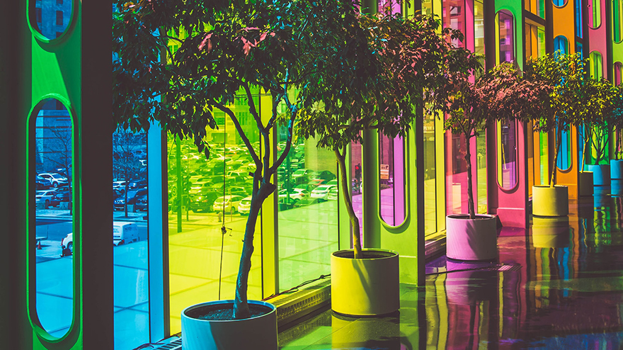
Green
The colour green connotes serenity, calmness, and warmth. It is used in the interior design of healthcare, hospitals, clinics, and relaxation spaces as it is associated with well-being and tranquillity.
Blue
Blue represents optimism, security, and confidence. It is regularly used in commercial areas, offices, and banks to create soothing and cool architecture. The colour blue is used to keep humans alert and active.
Purple
Purple connotes calmness, softness, relaxation, and well-being.
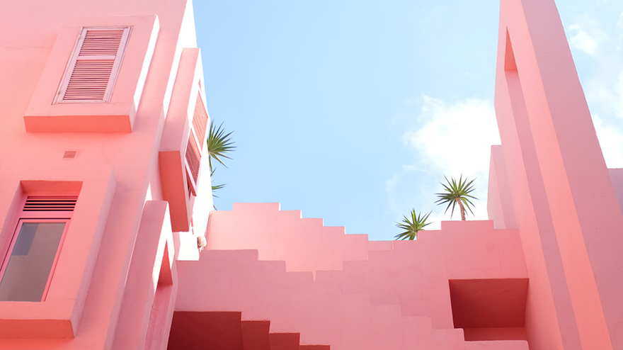
White
White is associated with cleanliness and purity. It gives a feeling of calmness and being alert. It makes the architectural spaces appear wider and brighter.
Colours used in our architectural spaces have an impact on our nervous system, which could be positive or negative. Buildings with diverse and lively colours can give us optimistic feelings and make us feel better. Different combinations of colours can be used in architecture, such as monochromatic, analogous, complementary, split complementary, triad, tetrad, and square.
LEAVE A COMMENT
Recent Posts


0.3263